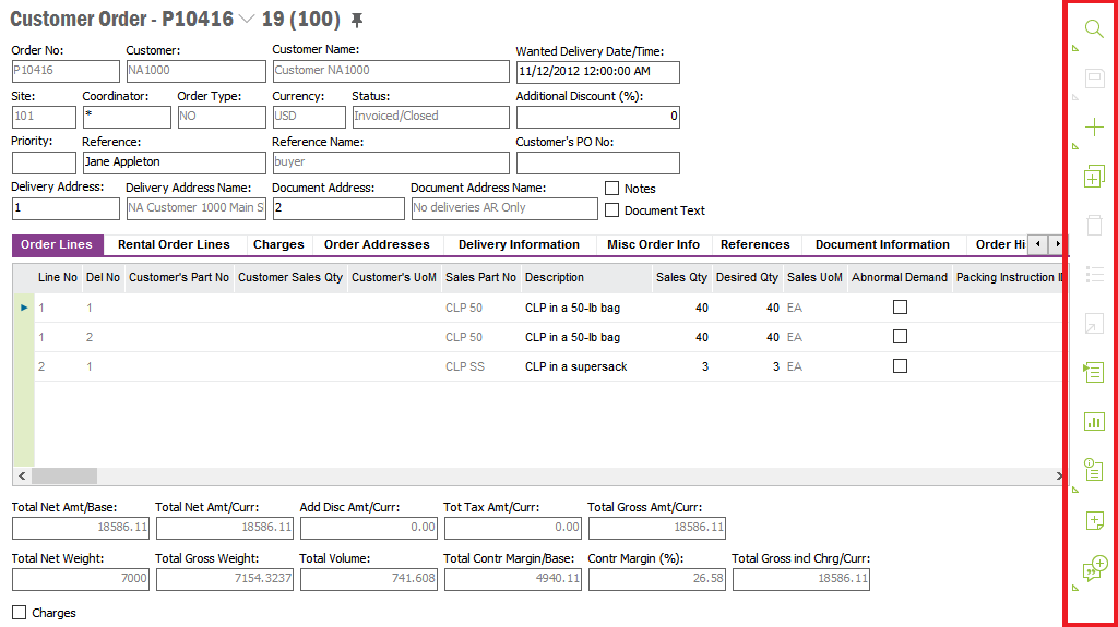
The Page Toolbar contains a number of buttons you use when working in an IFS Application page.
N/A
N/A
N/A
N/A
Figure 1: Using page tool bar
The following buttons are available:
Note: The action you chose will be used for the page/object you have open in your work area, it is not used for the context panels, e.g. Attachment Panel etc. Read more about Working in IFS Application Pages
 |
Search: Opens the Search dialog box where you enter your search criteria to find the information you require. The Search drop-down list also contains Previous Search, Saved Searches and Populate- | |
 |
Save: Saves your data to the database. The Save drop-down list contains Save as Template and Save as draft. | |
 |
New: Prepares a page for a new record. The New drop-down list also contains Duplicate, New from Template and Drafts. | |
 |
Delete: Prepares a record to be deleted. Use Save to complete the removal from the database. | |
 |
List of Values: Use this when creating or modifying a record. Place the cursor in a field which has related basic data. By using List of Values, a dialog box containing all available values will open up. E.g. to enter an account, click List of Values in the Account Group field and all available account groups will be displayed. | |
 |
Zoom: Opens the basic data page relevant to the field you are working in. E.g. when entering a customer order and you want to change/create customer basic data, you can use Zoom in the Customer No field to open up the Customer page. | |
 |
Context Menu: Opens the touch-friendly context menu. It has the same contents as the context menu you open via right mouse button. | |
 |
Chart Mode: Presents the data in the page in a chart. Read more in Using Chart Mode. | |
 |
Notes: Creates a note on the object you are working with. Read more in Using Sticky Notes | |
 |
Subscription: Invokes the subscription dialog where you can subscribe to certain objects to be notified of changes done to those objects. If you are already subscribed to the current object, it will be indicated with a different image. Read more in Using Subscriptions. | |
 |
Information Card. The button is enabled if there is an
Information Card configured for the page. Via the drop-down menu there are
two options:
|
Via the Context menu you can change the position of the tool bar to have it on the right hand side or left hand side of the work area.
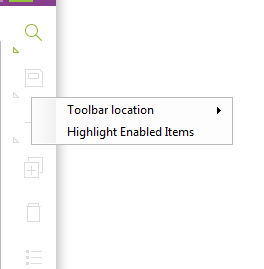
Figure 2: Page Toolbar Context menu
Via the context menu option Highlight Enabled Items you can select to highlight the enabled buttons, see example below:
Figure 3: Example highlighted toolbar buttons